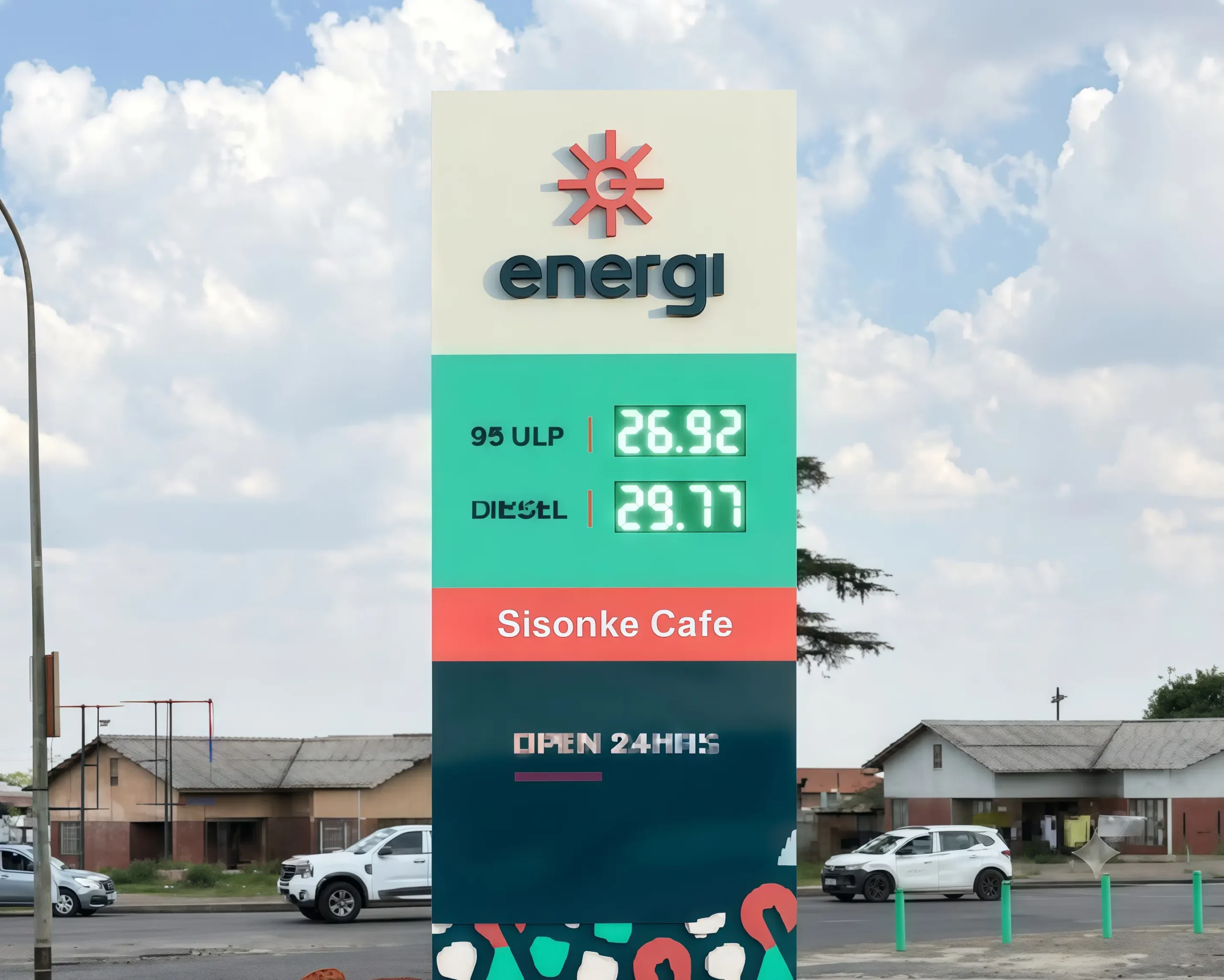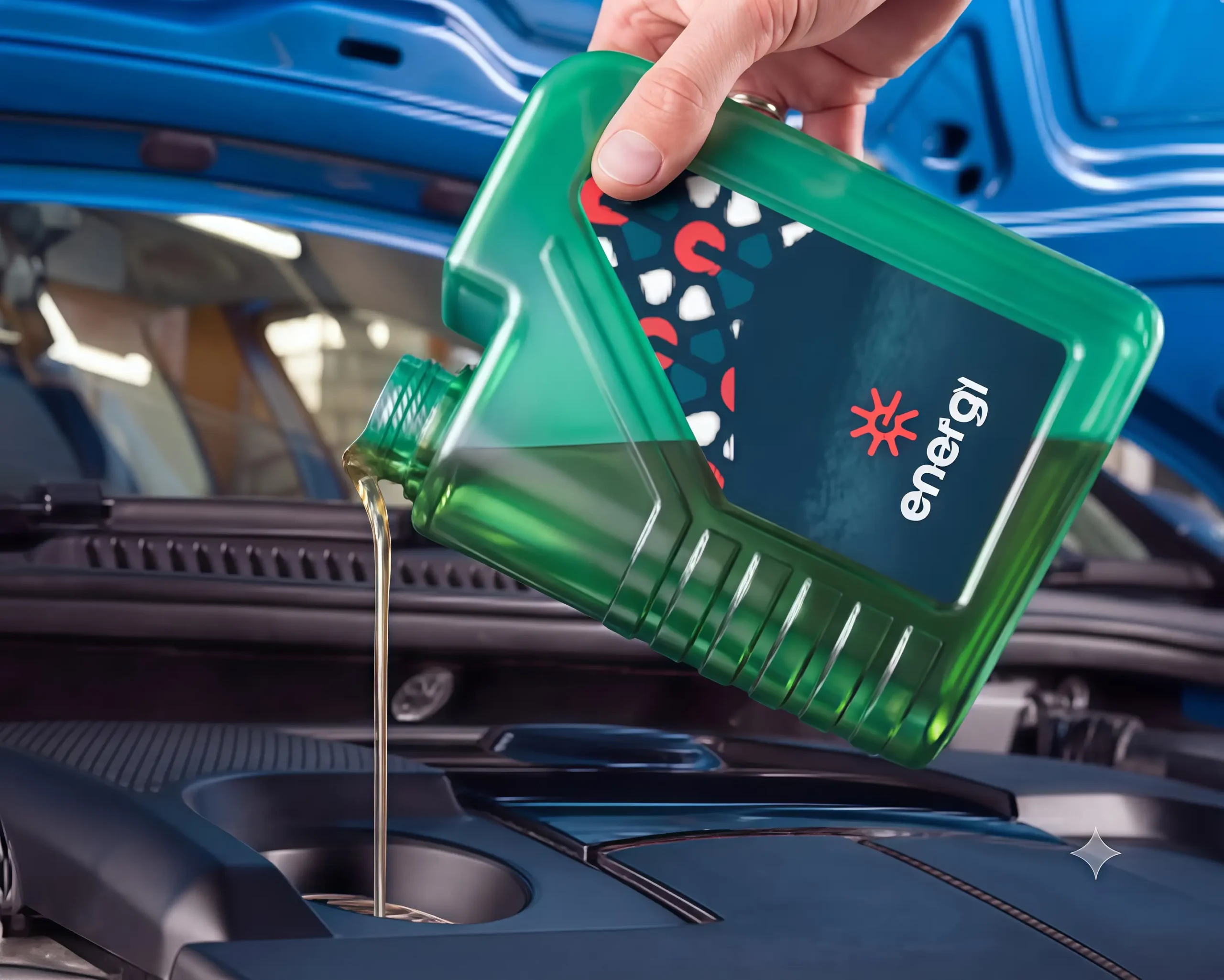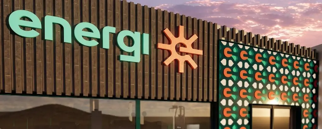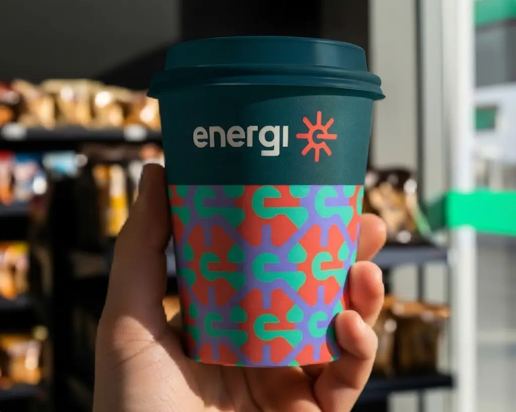

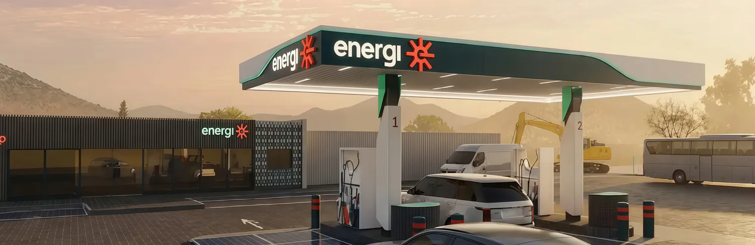
Petrol stations have become interchangeable. In a category dominated by legacy global brands, homogenous colours, and purely functional communication, standing out is extraordinarily difficult. Motorists routinely default to momentary convenience rather than brand loyalty.
The fundamental challenge was breaking through the severe visual fatigue of national highway corridors. Energi needed an identity that communicates rapid clarity at high speeds while removing friction from the driver’s refuelling routine.